Accessibility, what is it? and why should it matter to you?
The topic of accessibility has been prominent in the design and development communities for the past few years. With the establishment of the Bureau of Web Accessibility in 2017, the issue is certainly gaining a lot of traction and looks to only become more popular in the coming years. In short, having an accessible website means your website has been designed and built for users with any physical, cognitive, auditory, visual, or speech disability. Any user with a mild or severe disability should be able to browse web content with ease and void of any barriers. Creating a web presence that is inclusive to all is the ultimate goal.Accessibility should matter to anyone who has a web presence. Just because your website looks and functions perfectly for you, doesn’t mean it looks and works perfectly for everyone. In 2018, there were over 2,000 lawsuits filed regarding accessibility, and that number is expected to triple by the end of 2019. Government and education industries have experienced the brunt of these lawsuits; however, that does not mean a lawsuit is exclusive to large industries. Anyone can be targeted.
How does Firm Media tackle the ever-growing issue of accessibility?
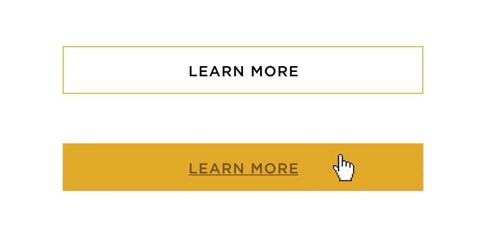
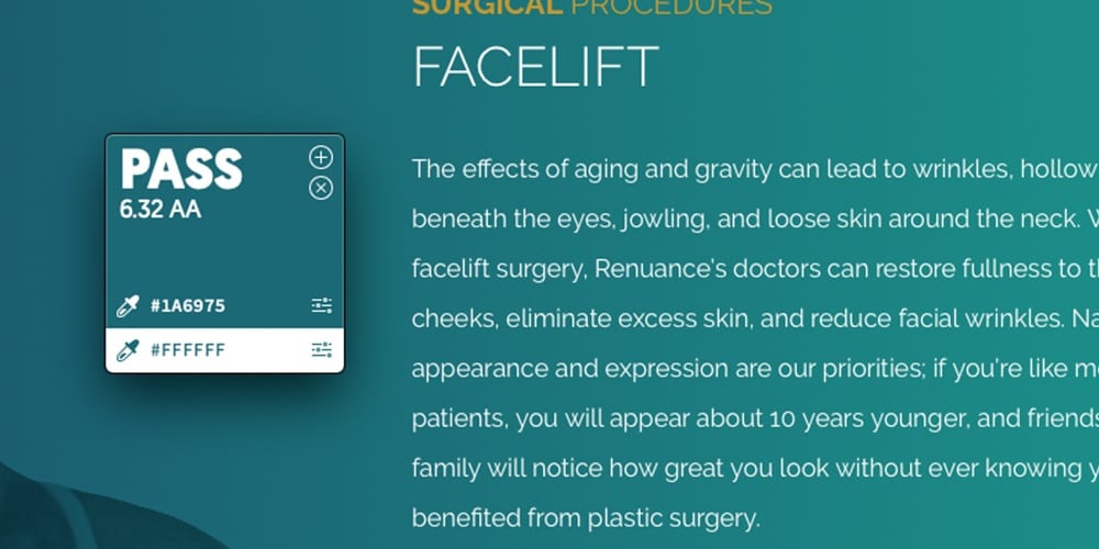
At Firm Media, accessibility is a significant topic within every department. Our design team is continuously researching and keeping up to date on the latest accessibility trends and solutions. In regards to new projects, our design team starts with specific guidelines that must be followed. These include: ensuring all colors used on the website meet the World Wide Web Consortium (W3C) color contrast guidelines, applying more than one indicator for links/buttons, and making sure text is always at a legible size for all devices and screen sizes. For older designs, we determine accessibility issues and implement solutions within every department to ensure we are doing our best to make sure all of our projects are held up to the same accessibility standards.


Company-wide, we do our best to meet the W3C guidelines, which sets the standard for web accessibility. Just because a web site is 99% accessible, that doesn’t mean it’s necessarily aesthetically pleasing. Like with everything, a balance must be found in creating websites able to be used by all but that also look and function beautifully. We have implemented accessibility disclaimers on all of our sites and installed accessibility plugins when needed, which makes navigating a website easier for those with any visual or other types of impairments. What we do for accessibility may be more than most, but it is just the start for an ongoing and growing topic.
How do I know if my website is accessible?
Since there is no set pass or fail test regarding accessibility, creating web content that is 100% accessible is hard to validate and most likely impossible to implement. For our clients, we conduct a manual test to simulate disabilities (such as color blindness or visual impairments) to determine if our websites are still user-friendly and easy to use. We then make updates based on the findings.Although all of our websites are now accessible, some sites may be more accessible than others. Which brings the question, What qualifies a website as accessible? The Bureau of Web Accessibility recently stated not a single 2020 presidential candidate’s website was fully accessible. Seems odd considering laws are now requiring all sites to be accessible to any user. As time moves on and these laws are better laid out regarding what exactly makes a website accessible, we will continue to design and develop our websites with all users in mind.


