In the past, it was easy to attract new patients to a medical practice simply through the benefit of outstanding credentials, a stellar reputation, and patients who were eager to offer referrals. Today, medical practitioners need to have a beautiful, informational, and easy-to-navigate website that also converts leads. Ultimately, the most successful medical practices have websites that inform prospective patients, build trust, and inspire action.
Here are five features that your medical website needs right now to convert the most leads—resulting in new patients and a boost in revenue for your medical practice.
1. Clear Call to Actions
Many medical practice websites lose out on attracting new patients simply because they do not tell visitors what to do next. Therefore, your website must feature clear calls to actions that are visible on every page and act as a signpost. These call to actions should point a visitor in the right direction for the action you wish them to take—signing up for a newsletter, submitting their contact information, or scheduling a one-on-one consultation at your office. Additionally, consider the following:
- A call to action serves as a transition between phases in a patient’s buying journey. They tell a user what to do next and contribute to a healthy sales funnel.
- Website visitors appreciate clear call to actions—and they expect them. Many people depend on the call to action because it makes it easy to engage directly with your practice.
- A call to action emphasizes the power of digital marketing and offers a return on your online advertising dollars.
2. Personalized Imagery, Videos, and Content
Suppose your website only features generic stock photos, lacks informative content that differentiates you from your practice, and fails to offer a glimpse into how you and your staff operate. In that case, a prospective patient is likely to leave your site and seek out a competitor who does present a more personalized approach online.
Ultimately, your site must show and tell a user why your practice is different and unique—and how your approach to patient care sets you apart from your competitors. You can offer a visitor insight into your practice’s values by using custom photography, video, and content that showcases your staff members, describes your services, and reveals a behind-the-scenes look at your office. If you can begin to build trust with a user from their initial visit to your website, it is that much more likely they will be motivated to visit your office.
3. Before and After Patient Photos
On a medical practice’s website, photo galleries are some of the most viewed and highest converting pages. If a potential patient is considering your practice for a specific procedure and treatment, they want to validate that you can help them achieve their desired results. So, make it a point to take before and after photos of your patients—with their written permission to use them for marketing purposes—and feature them in a prominent place on your website. Not only does this build trust with website visitors, but it also gives added confidence when they reach out to schedule a consultation.
4. Highlight Awards, Recognition, Certifications, and Accreditations
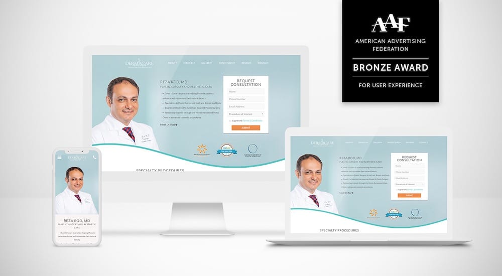
Another feature that can help your website’s conversion rates is showcasing awards, public or industry recognition, certifications, and accreditations that you, members of your practice, or your office as a whole have received. These features show that your medical or practice is respected, legitimate, and recognized by third-party groups or organizations as professionals in the medical field. For example, a prospective patient will feel more confident contacting you for a consultation if you proudly display that you are board-certified by the American Board of Plastic Surgery when compared with a competitor who may not be able to claim this distinction. Similarly, a certification from the American Association of Oral and Maxillofacial Surgeons can help prospective patients looking for an oral surgeon feel that their doctor has extensive skill and experience.
5. Responsive Web Design
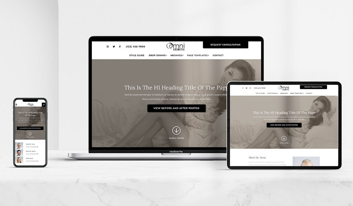
Your website’s content, images, and site structure should allow a user a seamless viewing and interaction experience. In addition, your site should offer a positive experience whether they are on a desktop or laptop computer or accessing your site on a smartphone or tablet. In the last seven years, there has been a 222% increase in mobile users. So, for your website to convert effectively, a mobile user must be able to navigate your site easily no matter their screen size—a responsive design results in satisfied visitors, which leads to increased conversions.
Increase Conversions with a Website Redesign
We are passionate about helping our clients achieve their digital marketing goals and ensuring their website converts qualified patients. The team at Firm Media would love to schedule a consultation with your medical practice and discuss your goals. Reach out to our team today.


