PART ONE OF A SERIES: Web Design for Internet Marketing
It’s time to rethink the role your website plays in your business. Ten years ago, the marketing experts were saying, “You gotta have a website. Even if it’s just a one page brochure with your phone number, you gotta have one.” Today, that message has changed. That’s because the audience has changed.
This is the generation that has been using social media and search engines since they were teenagers (“Generation Google” or “Gen G” as Jeff Jarvis coined them in his book, What Would Google Do?). Now, they’ve grown up and so too must your web presence. To this day, too many businesses treat their websites just like they would a business card, including only the bare minimum of static information with the hope that curiosity or faith or some other magical force will drive customers to take the initiative. But that’s the wrong way to think. The difference between a website and a business card is that when you hand someone a card or brochure, you’ve already shaken their hand, given your elevator pitch and made that first connection. With a website, all of that happens in reverse. For most people, your website is the first impression that they’ll get of your business and the sole factor in their decision whether to contact you or not.
That’s why it’s not enough to have a website just to have one. Gone are the days when web users would take the time to sift through your homepage, click through to the About page in search of the Contact page so they can copy and paste your email address into their Hotmail account and ask for more information. Today, they are far more likely to hit the “Back” button than slog through a website that was constructed more like a book than the web content they’re accustomed to consuming.
Gen G is used to having a tremendous amount of information being thrown at them all at once, and when they land on a website, they want to be able to find what they are looking for immediately. Because you’ve only got a few seconds to grab the attention of your visitors and engage them, every aspect of your website must be tailored towards conversion. At the very least, that means:
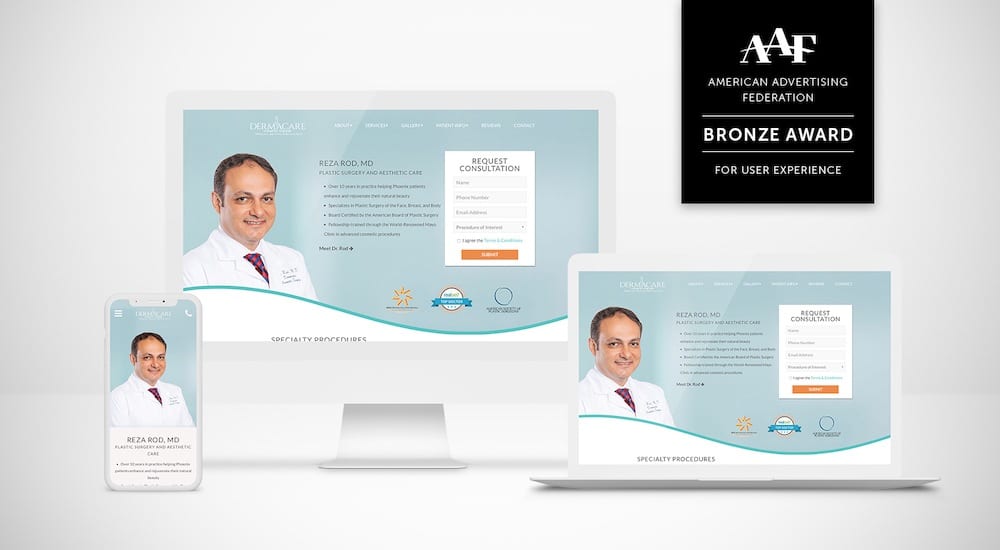
- A contact form on the front page.
- Your phone number clearly visible on each page.
- Clear invitations to bookmark your page or follow you on Facebook or Twitter.
If someone comes to your website and doesn’t take one of these actions – call, contact or bookmark – it’s almost the same thing as losing a sale. With this in mind, consider this: How much did you pay for your current website design? Not only that, but who did you pay? Was it someone with a deep knowledge of how to design conversion friendly websites? Was it someone who has done careful activity analysis to determine exactly what it is that your visitors are looking for when they come to your site? Or was it your neighbor’s son from down the street who’s a “real whiz” with computers?
Now, ask yourself, how much and who did you pay for your last full page print ad that ran in a magazine? Chances are you paid exponentially more than you did for your website and you hired a professional with a strong background in marketing and design. That’s because you had to reach your reader and convey everything that was essential to making that conversion in just one page. And at best, your ad would only get a passing glance as a reader flipped through. It’s the same with your website.
Your website is like a full page, interactive print – the main difference, though, is that you’ll have it for six to eight years. Your website is what hundreds, perhaps thousands of potential customers will be basing their decision off of when choosing between you and your competitor (who, remember, is just a mouse click away). That’s why it’s absolutely imperative that your business has a conversion friendly website.
Stop by our Website: www.firm-media.com
Follow us on Twitter: @FirmMedia
Follow us on Facebook: Firm Media Fan Page


